
| |
| |
|
Search
|
Exhibitions
|
Textual Research
|
News
|
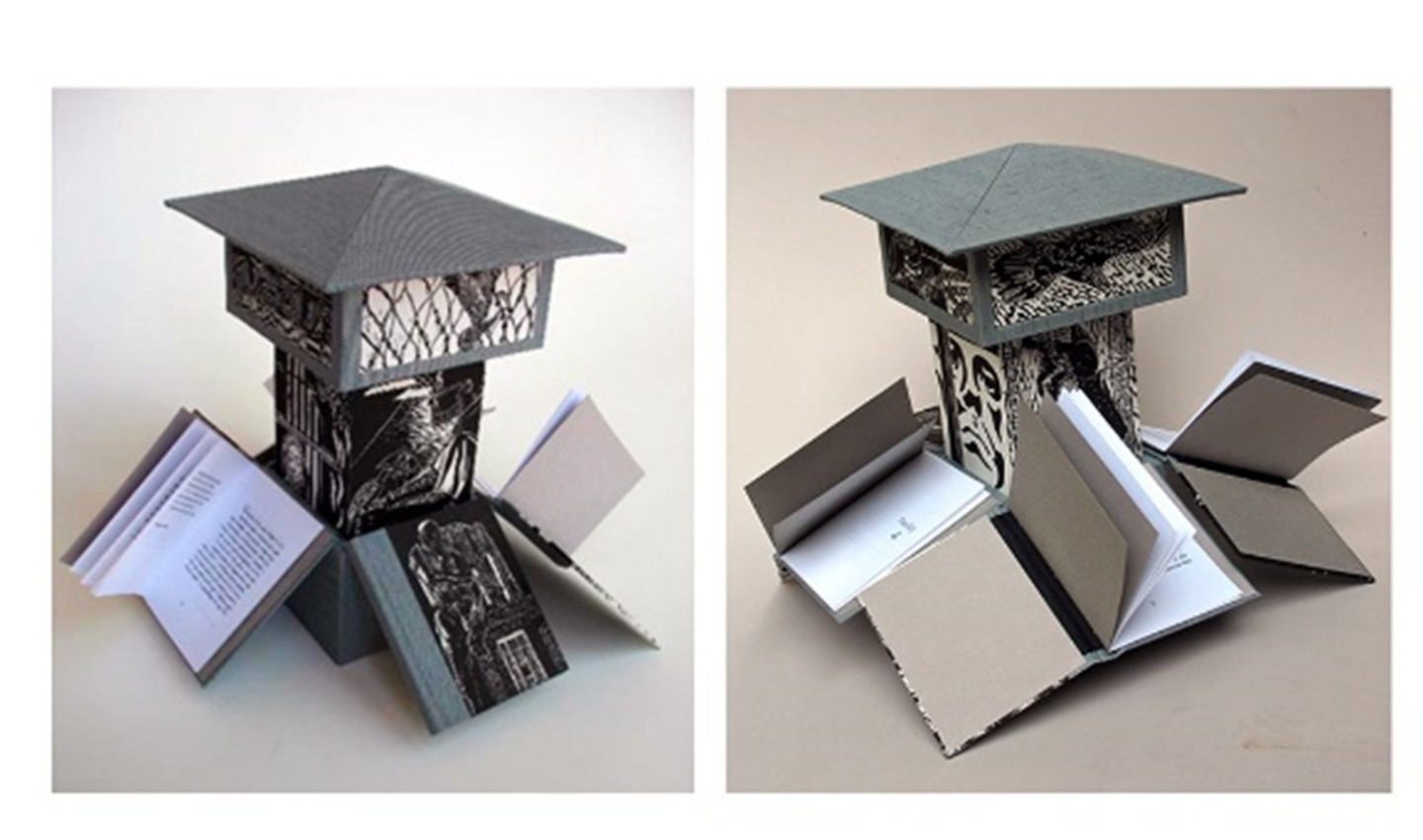
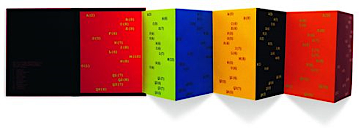
Featured South African Artist's Book
Online Resources | Booknesses Archive | Samplings Archive | Sign up |

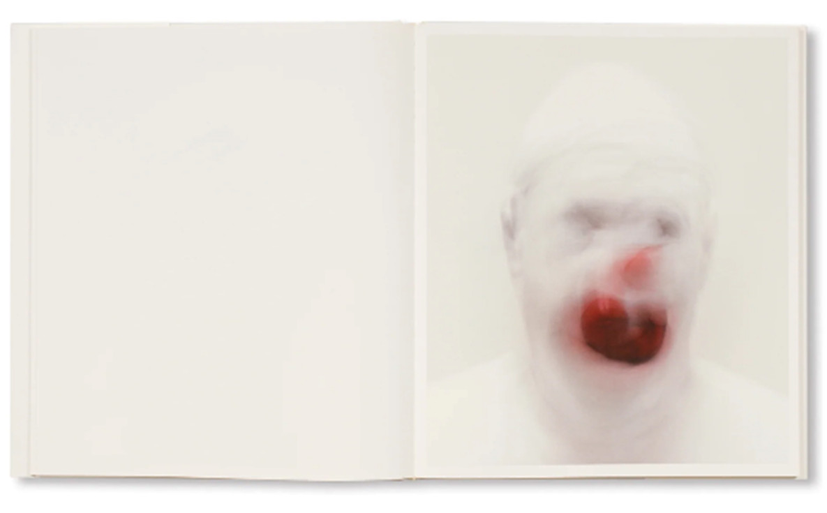
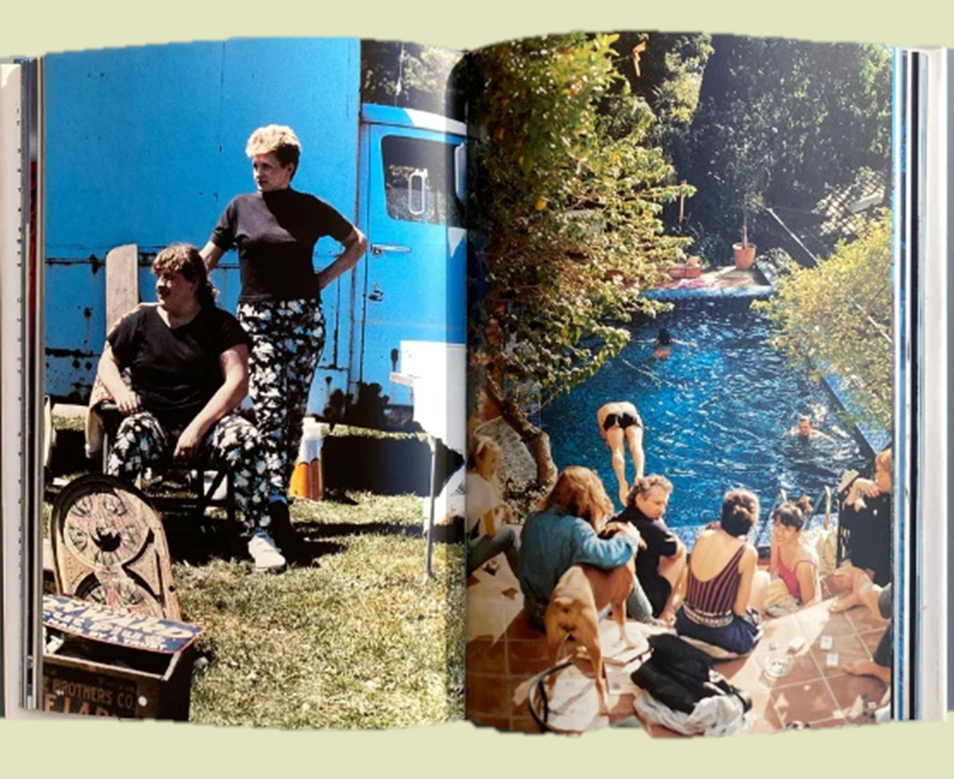
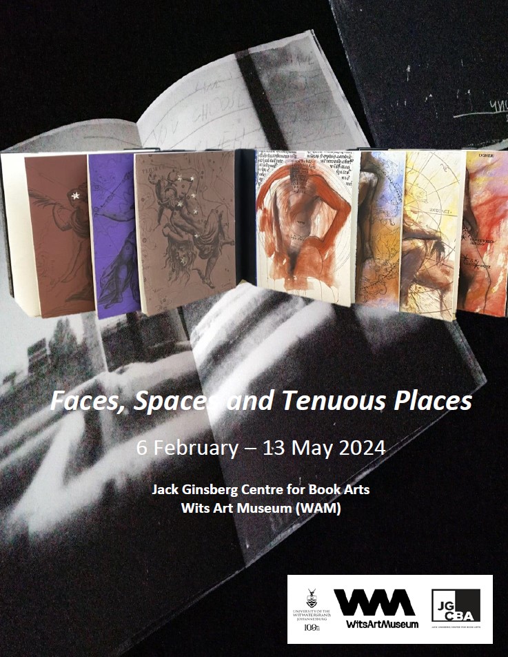
Faces, Spaces and Tenuous Places
| |||||||||||||||||||||||||||||||||||||||||||||||||||||||||||


© Jack Ginsberg Centre for Book Arts (JGCBA). All rights reserved. |